
 +1 (929) 568-4698
Data VisualizationAutomotiveEnterprise
A sales intelligence dashboard for a global automotive manufacturer
An automotive manufacturer needed to see how their car dealerships were performing across the US. We built a dashboard that turns their sales data into interactive maps, so the team could see at a glance what the market looked like and where sales were being won or lost.
Got a similar project? Let's talk→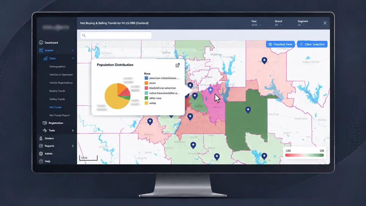
The situation
Before we started
Automotive manufacturers usually sell through thousands of independent dealerships, each assigned its own trade zone. Our client had detailed sales data on every one of its US dealers. But those numbers mostly lived in databases and spreadsheets, so it was hard to tell why one dealer was ahead and another was falling behind.
Answering that question takes geography. A dealer's sales can rise or fall because of its local market, like when buyers go to dealerships nearby instead. That kind of pattern is almost invisible in a spreadsheet and obvious on a map.
Our job was to build that map: a dashboard that combined sales and demographic data on one interactive view of the US, for teams that needed to judge dealer performance and act on it.
The challenge
What made it hard
- Scale & Performance
The map had to render more than 70,000 census tracts and stay fast enough to pan, zoom, and click through without lag.
- Granularity
The same sales data had to roll up and drill down across six geographic levels, from region to state to individual census tract.
- Readability
Dense sales and demographic data had to make sense at a glance to people who weren't data analysts.
- Accuracy
Every number had to match exactly across the map, the tables, and the exported PDF reports.
The Solution
What we built
We built the whole product, frontend and backend. Users start with a map of the US, switch on the geographic layers they need, and select any area to see its data. Every view, from a single census tract to the whole country, pulls from the same source.
01
Layered Map
Users can turn on any combination of six boundary layers, from regions and states down to trade zones and census tracts. Selecting one or more areas on the map brings up their data.
02
Demographics Analysis
For any selected area, the dashboard breaks down population by race, income, gender, and age. Each breakdown has a chart view for quick reading and a table view for exact numbers.
03
Local Sales Heatmap
For any dealer, the map shows where its buyers come from in green and where its local buyers go instead in red, with darker shades for bigger numbers.
04
National Sales Heatmap
A country-wide view ranks every trade zone on measures like sales effectiveness, so the strongest and weakest dealers across the US stand out immediately.
05
Geography Comparison
Users can place two or more areas side by side and compare their demographics and sales data chart for chart.
06
Performance Reports
The dashboard generates a full PDF report of any dealer, comparing expected and actual sales, broken down by brand and vehicle segment.
The result
Where it got them
The manufacturer's teams could now answer questions about dealer performance in minutes instead of digging through tables. When a dealer fell short of its target, they could open its trade zone, check its local market, and see what was going on.
Instead of just pointing at a number, the team could show a dealer a map of where its customers were going and a PDF report breaking down its sales by brand and segment.
The same tools also worked at every level, from a single neighborhood to the entire country. A regional team could zoom in on one market, and a national team could compare every trade zone at once.

We had sales data on every dealer in the US, but no clear way to see why some were winning and others were falling behind.
Wellerman built the entire sales intelligence dashboard, frontend and backend: an interactive map covering 70,000+ census tracts, with sales heatmaps, demographic breakdowns, and exportable dealer reports.
Our team went from raw numbers to 25+ charts and reports for analyzing any dealer or market in one place. I'd bring them in again on any data-heavy product.
 AnonymousSales Leadership @ Global Automotive Manufacturer
Facing something similar?
If you're dealing with the same kind of challenges, we'd like to hear about it. No sales pitch and no commitment, just a conversation.
If we're not the right fit, we'll say so.